HOW TO CREATE PRODUCT IMAGES THAT REALLY CONVERT
EMMA
October 20th, 2019
You might have heard on the grapevine that there’s a buzz around voice search as the future of online shopping, but the truth is image search is up there with it. Studies from Gartner predict that visual and voice search will be responsible for 30 percent of all eCommerce revenue by 2021.
We are an image-centered culture. We respond to beautiful things, idyllic images, and relatable pictures. Our human brain is programmed to respond to images in less than a second. In fact, it takes one-quarter of a second to register and attach meaning to an image, yet it takes six seconds to read 20 words.
When we’re browsing the web for things to buy, we want clear images of products. Why? So we can easily imagine integrating these things into our lives, whether we need them, want them, or a bit of both. Those fast-working neurons that register an image can rapidly create desire and emotions that you want a customer to feel to make a purchase. So, visuals on your product pages are pretty important to your bottom line and your customer engagement.
That means, as a store owner, your product images have to be spot on. There are no two ways about it. The quality of your images is not only important for clarity, but it also speaks to your audience about your company values. A well-taken picture says ‘professionalism’ and promotes trust. A badly taken picture says ‘sloppy’ and ‘cuts corners’.
But don’t worry, it doesn’t take multiple designers and fancy photographers to create a clean, sleek product image. You can do it easily yourself by following these simple tips. Plus, we’ll tell you how to optimize your pictures for great image SEO, once you’ve nailed the art of taking awesome products images.
We’ve got some really important stuff in here, but if you’re short on time skip to the top 5 hacks below for a fast run-down to optimized product images.
Product images look simple. Good ones do, anyway. So, that’s the look you want to go for. Images that have different colored backgrounds (or clutter in the background) will distract from the item and create momentary confusion. Remember that our brain is processing an image in less than a heartbeat, so minimum fuss equates to maximum recognition.
When taking and considering your product images, always keep in mind the image checklist.
Your product image checklist:
- Clear
- Consistent
- Accurate
Live and breathe these three points and you’ll create product images to see your store soar. Let’s see how they work in action. Take a look at these examples. Each product is alone in the shot – even shoes. Just because it’s a pair, doesn’t mean you need to see both.
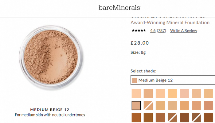
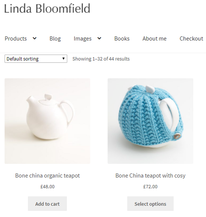
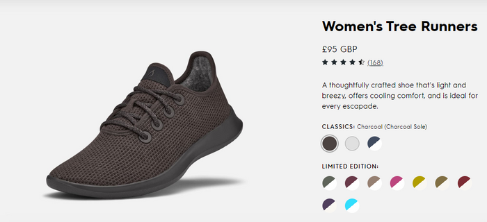
This is an example of clarity. We know what the other shoe will look like, so there’s only the need to photograph one. These images are clearly visible with no fuzz or blurring, and a potential buyer can click on different colors or shades. This is where consistency plays a crucial role. If your product is the same in varying colors and/or shades, it’s important to show the color change with as little alteration to the product shot as possible. The only difference in each product shot is the colors and shades. To stay on-brand and avoid confusing your customers, consistency is key.
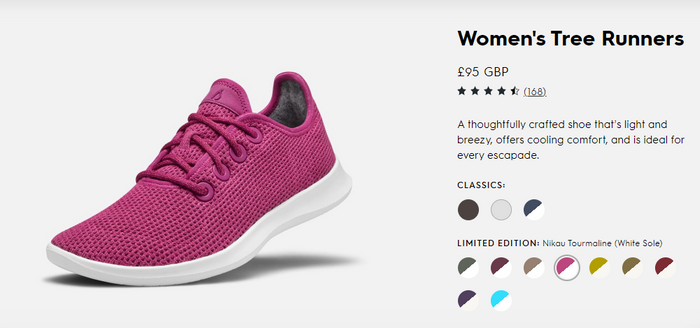
So here, we can see that although the shoe has changed color, it’s the same image; the same size, the same dimensions and has the same amount of view options and zoom. Keeping your visuals consistent across your store product pages is also going to inspire consumer trust and keep your site neat and beautiful.
The final point to make is to always photograph the real product. It must be the exact product that your customer is going to buy. This is what we mean by accuracy. High definition images are useful for zoom features and rotation; helping your audience get up close and personal with your product, and helping them to see all the details that will make them fall in love with it.
HOW MANY PRODUCT IMAGES DO YOU NEED?
You need more pictures per product than you may realize. To give your customers as much visual information as possible, we suggest at least five to 10 images. This may alter depending on how many color or style variations, but ideally aim to show each product from multiple angles. Follow the below checklist to make sure you have as many helpful shots as possible, so your customer can understand what your product really looks and feels like.
Multiple image checklist:
- As many angles as possible, front, back, bottom, top etc.
- Different colors (if applicable).
- High resolution to enable zoom.
- Lifestyle shot (the product in situ or on a model).
- 360O rotation.
- Close-up of fabric or material.
- Specific detail. Is your logo embroidered on the product? Show this.
HOW TO DIY YOUR PRODUCT IMAGES
Don’t be daunted by a home photoshoot. It sounds more complex than it is. With a few simple tools and the willingness to put in the effort yourself, you can save your hard-earned dollars and still get awesome results. First thing’s first, and that’s to set up your home studio.
Here are three simple steps to an indoor product-shot studio:
STEP 1 – SETTING THE STAGE
If you have products that will easily fit on a chair or table, you can create an indoor-studio very easily. Create a white background from a large piece of white paper or material pinned to the back of a chair or stuck to the wall behind a table. Alternatively, you could even place a chair or stool onto your table and hang a piece of paper, or very bright, white material, over it. The idea here is to create a white background that forms an L-shape. The space behind the product and the surface on which it’s sat should all be white. If your products will fit inside a clear plastic container (the kind you use for storage), you can set it on its side and cover the interior with white paper. This helps the light to naturally diffuse and prevent any ugly or hard to edit shadows.
Top stage setting tip: It’s about getting a product shot in a sea of white space. A roll of white paper can be unraveled over chairs, tables, and even hung from the top of a wall and pulled out along the floor for larger photoshoots. It’s inexpensive and effective.
STEP 2 – LIGHT IT UP
Make sure you take product shots during the day in a bright space with lots of natural light. Natural light is always the best light. Avoid evening shoots where you need a lot of lamplight and overhead lights, they may be full watt, but believe me, you’ll notice the difference. Lamps can be utilized to enhance the natural light you already have. So, for example, if you’re using the storage container, I advise placing it in a bright airy space and then flanking either side with lamps. You can even use one above too. It’s not necessary, but it may help on duller days.
Top lighting tip: If you have too much light and it’s creating shadows, try placing a thin piece of white material over the window. Just as you find with the lightbox, this helps to diffuse and soften the light.
STEP 3 – STAND STRONG
Your product should be on a stable, smooth and level surface – and so too should your camera. (That includes your phone if you’re using it to take pictures.) Unsteady cameras lead to wobbly, blurred images that are much harder to remedy afterward than if you take your time in the early stages. So be prepared, get yourself a tripod. It doesn’t have to be expensive. In fact, anything steady that you can set your camera on will do. You may have a stool or chair you can utilize, for example, if it’s at the right height. Use your imagination, but make sure you are comfortable with it, especially if you’ll be taking a lot of pictures.
Top stability tip: Our phones are just a powerful as professional cameras these days, so if you know your phone can take a decent picture, you don’t need to fork out for a DSLR. But resist the urge to point and shoot, as you would normally. You may think you’re steady, but our bodies move all the time (with every breath in fact) and smartphone stabilizers are cheap and easy to buy. Invest in one and you’ll save time and frustration later on.
Release your inner artist
Everyone can take a great product shot. And, don’t be frightened to play around with it at first. Find the best light spots, the optimal time of day (we’d advise against midday, as the sunlight can be too strong at this time), and where you are most comfortable. Then, try out how you want your products to look. Don’t be too precious in the first instances.
For clothes and apparel, these look best styled on a mannequin to give them shape. You can crop any parts of the mannequin out at a later date or use a white one to easily keep your image looking clean.
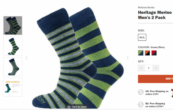
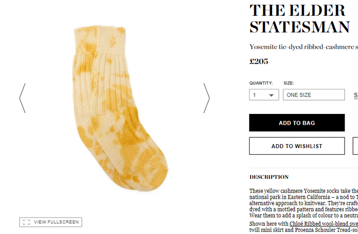
Let’s look at some socks to illustrate apparel images. The first is visually more appealing because you can see how it will look on your feet. Your mind doesn’t have to imagine the first fundamental step; it’s free to linger on the colors, and how it might feel on your own foot. In short, because the image has done a lot of the work for you, it’s easier to engage with the product. The sock on the bottom takes more work and doesn’t look quite as appealing. This is really how it’s going to look in your sock drawer, and while it’s a valid product image (one of those five to 10 examples) it’s not the best to lead with.
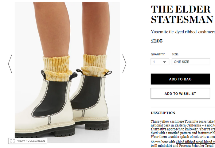
This is much better. Suddenly there’s context and we know how the socks will look on a person. That is, how they may look on you. If you don’t have mannequins, use people. They too can be photographed against a white background. Remember the rule of consistency though when using models. A few models will create recognizable characters for your clothes, and use similar stances to build up a clean and clear product identity.
No designer required
So, now you’ve taken all of your product shots, the next step is what makes the difference between mediocre product images and professional, stand-out images that will convert customers. It’s the editing stage. But don’t worry, you don’t need a graphic design qualification, or even a designer, to get the kind of profession finish that will make your product pages stand out.
Photoshop is the perfect tool for touching up your pictures. What’s more, you can now get it on your phone as an app, making it even easier to edit your smartphone pictures. In fact, there are a plethora of apps and tools that will make editing your pictures easy. Photoshop is one, as is Lightroom, Paint, and Canva. The list goes on but these are by far the most popular, the easiest to use, and importantly have a wide variety of YouTube videos offering helpful tutorials. Again, play with what you want to achieve with a few product shots and then hone down on a specific set of processes to get your products looking consistent. Once you’ve got the hang of your editing software, you’ll want to do three very important things:
- Color correction. Even with the best of cameras, you’ll probably want to make a few tweaks to the color. This is to ensure consistency across your pictures. Most programs offer easy ways to color correct, either manually using a color scale and preview, or automatically at the click of a button.
- Background removal. This is where you will be thankful for your white background. It makes cutting your product away from any background noise much easier and cleaner. In fact, many online retailers like Amazon require products to be on a white background. At this point, you can choose to remove it completely or enhance the white to clear out any shadows or imperfections.
- Sizing and cropping. Consistency also means having the same size images. It’s jarring when images appear in different formats and sizes. When they’re of a uniform size you’ll find your store looks tidier and is easier to navigate. It’s also crucial for avoiding that ‘accidentally cropped’ look. You know the one. The look where you’ve uploaded a file that’s too large and it’s been positioned strangely. (We’ll come to Shopify sizes shortly). Editing software can be useful for understanding what resolution your pictures are at, and for adapting them to optimize your site without drowning it in large files.
IMAGE GUIDELINES
Even if you are in the early stages of setting up your online store on Shopify, and have minimal products to list, it’s well worth coming up with image guidelines to follow. Image guidelines are simply a set of rules and standards that you come up with for your product pictures. It helps with, you guessed it, consistency. For example, you may have a particular resolution and size to save them to. You might want to save all images in a square format and always color-correct to reflect a certain tone, for example.
Why have image guidelines? They will help maintain a standard of professionalism across all your product descriptions and boxes. It also means that as your business grows, these standards remain consistent. It may be you taking all your product pictures, editing and uploading them today but in the future you may have a member of staff (or a team) responsible for this kind of task. It helps to already have your guideline in place.
PRODUCT IMAGE SIZES ON SHOPIFY
Now we come to the real nitty-gritty of your images. You have a pretty substantial array of beautiful photos to upload to your store, and you want to make sure that they land on the site, still looking just as gorgeous.
Now, product images that appear next to each other in your Shopify Collections can show up in different sizes, so it’s important to standardize them all first (as we mentioned earlier). So, here comes some math.
Product and Collection images can be up to 4472 x 4472 pixels on Shopify. However, a size of 2048 x 2048 is advisable. You can view your image pixels in most editing software, or roughly speaking 2048 pixels (at a dots-per-inch resolution of 96) translates as about 54 centimeters. Or if you’re working in inches, 2048 pixels (again at 96 dpi) works out about 23 inches.
In many themes, Shopify will resize where necessary, but if you have different image sizes before uploading to your Collections, they may look out-of-sync. It’s best to make sure all of your images are the same dimensions and resolution before uploading (warning, we may say ‘consistency’ again here). That way you avoid any awkward alignment.
If you do see that your images look misaligned, try clicking on Theme Settings and going to your Collections Page. There’s a tool for Align Product Rows. That should sort it.
Optimize your in-store images
You’ve heard the saying ‘time is money’. That’s true for your site; every millisecond of load time is a potential customer lost. Getting the balance between high-res, beautiful and clear images, and fast load time is the Holy Grail of eCommerce images.
The need for speed is crucial yet varied. The internet is getting faster and our sites need to keep up with an impatient audience. As consumers, we love images. An image can create desire, emotional connection, and engagement in a heartbeat with no need to read and digest. But it’s images that potentially slow our sites. Large image files can hinder the site load time far more than text. Not only that, but we’re also up against varying speeds. Barriers to customer download time depend on the country of residence, networks, bandwidths, mobile plans, and much more. So it’s far from a one-size-fits-all. What we can do, as online store owners, is to optimize what we add to our sites. ‘Optimizing’ in this sense simply means removing as many of our known barriers as possible to deliver the best customer experience. So here are four steps to optimizing your images for optimal customer experience.
Four steps to image optimization:
- Review and measure. React to your customer behavior. You need the facts before you can make changes and improvements.
- Get image savvy. While there are no hard and fast rules for image optimization, there are best practice principles.
- Check your file sizes. The bigger the file, the longer your customers have to wait.
- Make it personal. Remember your time is also precious. Find what works for you and avoid drowning in information.
Step 1: Review and measure. How do you know if your images are optimized or not? One way is to run them through a site like WebPageTest.org. This will audit your images for you, and clearly state if you need to compress them and tell you how much faster each image could be. While a tool such as Lighthouse will highlight if you have any ‘lazy’ images. Often we have images in the background, for example on a carousel, that are draining load time yet add very little value. Auditing your site for images like these can help streamline your image content. Keep the most relevant images for your customers at the forefront and trim out those with less engagement and value.
Step 2: Get image savvy. Rules for best practice will always help you add value with your images and support your online brand. Avoid placing text within images. Not only is this poor SEO practice (search engines won’t read the text in images) it can also hinder download time and confuse customers. Have you ever mistakenly tried to click on text embedded in an image thinking it would lead somewhere? This misconception can happen easily on mobile and be frustrating. Use a Vector image for simple graphics, such as logos and geometric shapes and a Raster image for more complicated images, such as photographs. Vectors tend to zoom in and out without losing the clean lines, while Raster may look pixelated on a large HD screen. JPEGS are the most favored and easiest to use and compress (we’ll get to that in the next step).
Step 3: Check your file sizes. Image file sizes are one of the primary causes of slow site load times. If you find that a part of your site is slow, or has a high bounce rate, this may be due to file size. To change your files without losing the image quality, you may need to utilize an app or a Shopify plugin. Alternatively, you can do this with your editing software but be aware that it may be a longer process. Adobe software has a ‘save for web’ option which is always worth clicking when saving a file.
There are several file converters, such a MozJPG and ImageOptim, that will reduce the size of an image without compromising too much on quality. JPEGMini is a fast tool that will automatically save as ‘best quality’. And, of course, Google released its own image compressor, Squoosh, at the end of last year.
Remember to always compress the original file, otherwise, you’ll enter into a Russian doll situation of reducing quality on an already less-than-perfect image.
STEP 4: MAKE IT PERSONAL.
Truth is, there is no formula for image optimization, and the web is awash with tools to help you do the two most important things: reduce size and keep quality. Keep your decisions personal to you and your site. If you are retaking your store photos or altering them for better optimization, make sure you begin with your most popular products. You make the most of your time by targeting your high-impact products that drive the most sales and potentially generate more traffic.
Image optimization is a vast topic. Our advice is to work out your own process and use one or two tools that suit you. Don’t get lost or baffled by the amount of information out there. We’ve given you an overview, but if you’re hungry for some in-depth exploration of image optimization, check out this article. Or if you’d like some guidance, get in contact with Orange Collar.
Alt text for SEO
Alt text (alternative text for images) is vital for the SEO of your product pages. This is what Google (and other search engines) read to understand what your picture is. This is also the text that will be on display, should your picture not load properly or unlink. It’s also what will be read aloud to visually impaired users. In fact, that was the primary purpose of alt text when it was first introduced. So it’s pretty important.
The maximum length for alt text in Shopify is 512 characters. Remember characters includes spaces and punctuation. The ideal maximum length is actually about 120 characters. Keep it short, to the point, and accurate. For example, that Bare Minerals foundation cited above, may have the alt text: Bare Minerals Loose Powder Foundation Medium Beige. At a mere 50 characters, this is a purposeful, no-nonsense description.
You can easily add your alt text to images in Shopify, by hovering over the image. It will present you with a row of icons, one of which says ALT. Click this to add it in. Alternatively, for multiple products, you can use a csv. file when importing a large number of files.
Additional things to consider…
If you’re worried about maintaining the copyright of your images, you can add a watermark overlay (most editing software will easily do this as a layer). This could be your brand logo that lightly sits over the image or you can place it in the corner of your image.
Check your image against your product description. Your product page is a blend of words and images, and successful ones are those that work together. Note if you’ve mentioned specific features and make sure that you’ve visually included them. For example, if you’ve mentioned that a raincoat has a detachable hood, ensure you have images with and without the hood and a close-up of how it attaches. The perfect page is an image that enhances the description and vice versa.
So, now you’re ready to take your product images into your own hands and to optimize them for store success. For more expert Shopify advice on how to supercharge your eCommerce business, chat to Orange Collar.
5 FAST HACKS FOR STUNNING AND OPTIMIZED PRODUCT IMAGES:
Hack #1 Take your own product images. You don’t need a photographer. You can easily take your own images with a few simple tools. Make your own studio using white paper or clean, white material and lots of natural light. For smaller products, you could place them within a transparent storage box, turned on its side with the lid off. Flank with white paper and place your product inside it with two lamps either side to soften any shadows. Position your product within your studio and either take a picture using a professional camera, or your smartphone works just as well. Ensure that it’s a clear photo taken using a tripod for steadiness.
Hack #2 Include multiple images on product pages. It’s no use just taking one or two shots. You need around five to 10 pictures, showing your product from all angles. This will enable your potential buyer to get up close and personal with what they’re buying. Allow them to imagine what it will look like in real life, and see all the details. Plus, if you have products in multiple colors, you’ll need to show this on your product page.
Hack #3 Edit, edit, edit. Use your preferred software or app to make color corrections, to check image sizes, and crop to the correct dimensions for your shop. Good editing is the difference between a mediocre product image and a clean-cut, professional image. Don’t forget that shopping platforms like Amazon require images on a clean white background. Check out any standards and rules before you edit many, many images.
Hack #4 Create product guidelines. Consistency is king. To stay consistent and to record those all-important dimensions, start your image guidelines. These will form your brand rules and regulations for images creation as your store grows. Your customers will appreciate and respond to images that are consistent across your site and social media, and any other platforms on which you sell your products.
Hack #5 Make images speedy and searchable. Don’t upload enormous files. Keep the resolution good quality, but the image size sensible, so that it doesn’t impact your load time. Shopify images are best set to 2048 x 2048 pixels and a square image (if that works for your theme). Then ensure your alt text is completed. Alternative image text is how your images will be read to the visually impaired, and it’s also how search engines discover them, so it can improve your product page SEO.