7 key elements for Shopify store growth in 2020
GUEST
October 6th, 2020
7 key elements for Shopify store growth in 2020
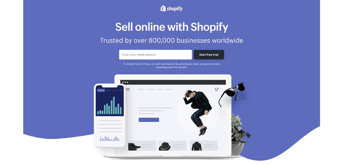
eCommerce is no longer a buzzword these days. Business owners are pushing towards making sales online and building brands based on the world wide web’s tools. Shopify is an emerging platform digital marketers are using to promote their products and services. We’ll go into what differentiates good Shopify websites from the greats and how to make your eCommerce kickass so that customers will keep coming back for more.
What Is Shopify?
Shopify stands out in the eCommerce industry as a platform for building websites because of its simplicity and elegance. It’s a third-party web-based platform that lets those starting a business for the first time launch their brand easily.
eCommerce stores built using Shopify can be managed remotely from any location and the platform has bundled everything that’s needed for building online businesses from scratch.
Why Should You Use Shopify over other eCommerce platforms?
Shopify makes launching new businesses very easily. It has tools built into it that make it a very secure, scalable, and reliable option. Over thousands of templates and themes are available for designing eCommerce websites in the store.
Plus, merchants get to enjoy the benefits of add-ons which expand on the existing features of their store. For anyone who wants to sell their products and services online, Shopify is the go-to choice when it comes to setting up and making eCommerce stores go live.
How Does Shopify Work?
This is how Shopify works:
· You sign up on the platform.
· Get a domain.
· Customize your themes.
· Add shipping and payment options.
· Integrate site add-ons and extensions for more features.
· Pick a pricing plan you’re happy with.
· And finally, publish your website!
When your website goes live, your customers can visit your website, place orders, and reach out to you directly through the site.
Key Elements for Shopify Store Growth in 2020
It’s not a one-size-fits-all approach when it comes to designing your Shopify store for organic growth. If you’re trying to start from the ground up and get running fast, here’s what you want to pay attention to.
1. Messenger Marketing
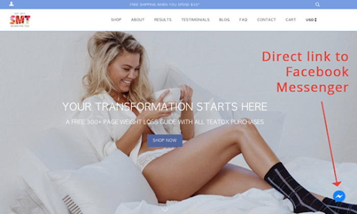
More than 1.3 billion people are using Facebook Messenger marketing to build their brands. Messenger chatbots are a convenient way to directly let your customers get in touch with you and interact.
These bots are displayed on your website as a tiny icon in a corner of the screen. The reason you want to use this tactic is that it draws in more leads and people respond to messenger bots a lot more than regular social media channels such as emails and landing page forms.
Take a look at how Skinny Tee redirects their customers seamlessly to Facebook when they click on the messenger bot icon.
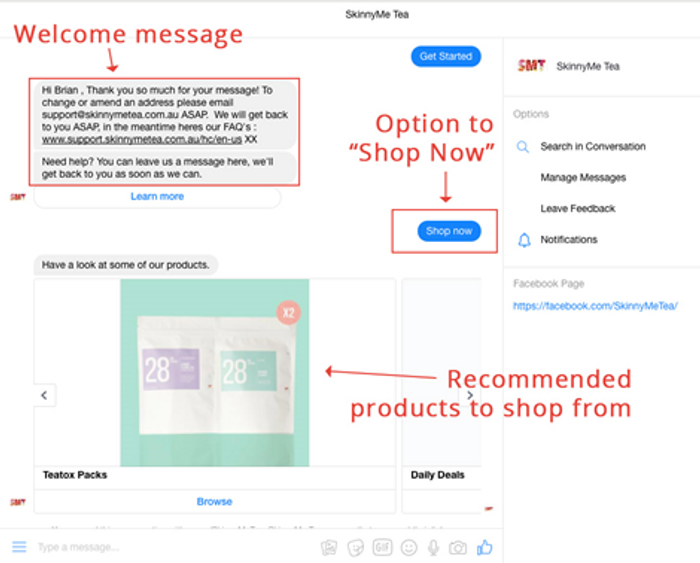
When they’re redirected to Facebook messenger, users are given options and asked relevant questions to help with their product search. These messenger bots also save time by responding quickly, thus converting website visitors faster.
2. Cart Abandonment Recovery Options
The average cart abandonment rate in eCommerce stores is a whopping 71.39%! That’s a lot of sales lost. Here’s a report that talks about different cart abandonment statistics globally.
Imagine if those were recovered. eCommerce brands have been exactly doing that recently. Cart abandonment recovery involves triggering a popup whenever customers add an item to the cart and attempt to leave the page. These popups often feature an exclusive discount code or coupons they can redeem for completing the purchase.
M25 Bikes is a brand that used Sumo’s Cart abandonment recovery add-on to boost their sales. At the end of the marketing campaign, when they looked at the results here’s what they found:
- Over 577 people viewed the popups and 130 signed up for emails.
- 26 customers redeemed coupons and discount codes.
- Over $50k USD was made in sales in just 50 days!
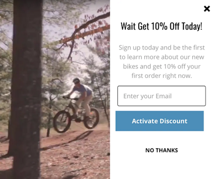
When you look at the sales recovery statistics, It makes sense that offering your visitors a 10% off for making a purchase or giving them incentives to complete the checkout makes your brand look simply irresistible, and they will be more likely to return to your website in the future.
3. Minimal Design
WP Standard was a winner of Shopify’s Design Award in the previous years and the reason behind that is because of its simple and minimalist design. The website looked clean, flawless, and elegant. And it’s just not the typography, but the overall user navigation experience. One of the key elements to creating amazing Shopify stores is taking professional product shots. The typography should be tasteful and when you’re going for the color palette, make sure it’s balanced and minimal.
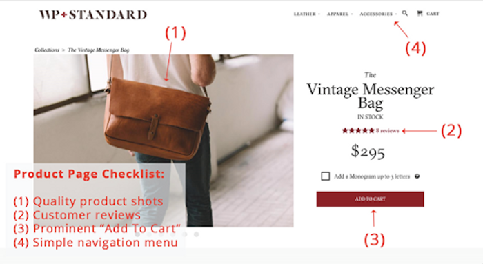
What we love about Shopify is that they have various themes that you can use for your store. These themes incorporate those very key design principles.
If you’re an experienced web developer, you can actually customize any existing Shopify themes based on your tastes and aesthetic preferences. But keep it simple and easy for your visitors when you’re just getting started.
4. Eye-Catching Visuals
Humans love seeing pictures. And a picture is way more worth than a 1,000 words.
Beardbrand mastered the use of imagery by using eye-catching visuals for their website. What’s cool about the brand is how they don’t beat around the bush.
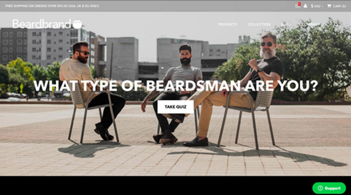
The minute you open up the website, you notice that they have a button for taking a quiz. This is just icing on the cake. And if you zoom in and click on the envelope icon, guess what happens?
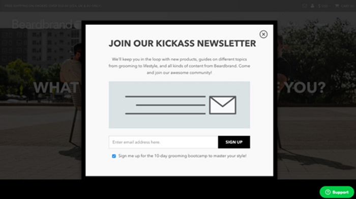
A newsletter sign up option pops-up. Notice how every step of the way the visuals seem to be beautiful and engaging? That’s how brands win over their customers.
Let’s take a look at a few more examples for inspiration.

The feed is a brand that lets users copyright protect their IP and data. When you visit their website, you are greeted with an interesting blend of animations about space and technology.
The navigation elements on the website, including the scroll bar, are very easy to use and the creative animations really immerse visitors into the experience. The space theme has been working well for them and Feed even won the ‘Site of the Day’ award by Awwwards.

Mikiya Kobayashi is a designer who showcases her portfolio using slow-moving animations and beautiful typography. The website was created originally in Japanese and later translated into English.
When a visitor checks it out, they immediately get an idea about her artistic style and craftsmanship. And the products shown give a good demonstration of her expertise and what she’s worked it, thus showcasing her versatility as a designer.
5. Mobile-Friendly Shopping Experience
The time being spent by U.S. adults on their mobile devices has increased substantially since the year 2018. People don’t just use their phones to talk to their friends online and send emails but also for shopping. Different mobile phones have different display sizes and if you don’t optimize your eCommerce store to be mobile-responsive, you will be losing out customers.
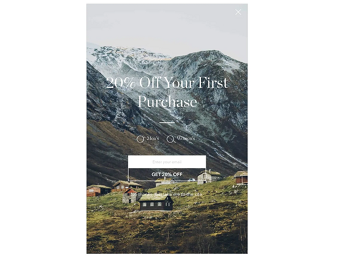
Taylor Stitch has an amazing mobile-responsive design. When you visit their landing page, you notice how clean and simple the landing page is. The 20% off CTA makes it more enticing for customers to check out their products.
If you take a look at their product catalog overview, you’ll find it’s not cluttered either. A chat bubble is included to immediately contact customer support for queries and the ‘Fund Now’ button refers to products on their clothing chain that are up for pre-sale.
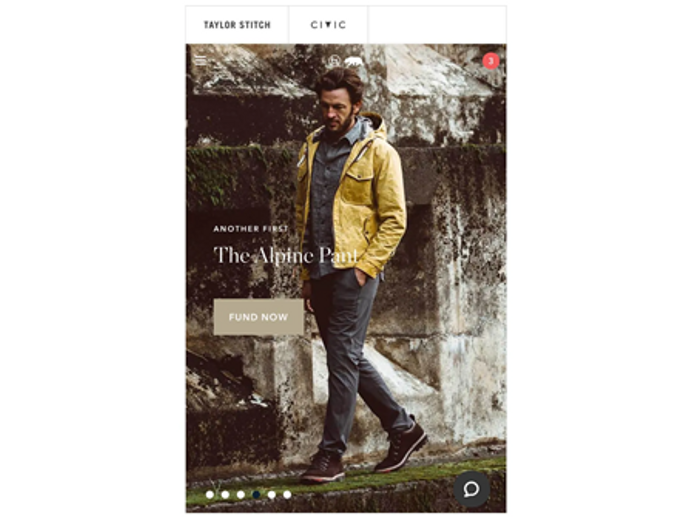
The navigation menu is also very simple. There’s an option to pick the color/shade and the size of the product. Once you are happy with the design and specifics, you just hit the ‘Add to Cart’ button and checkout.
Some websites even provide an option to save your checkout preferences so that you don’t have to mention the address or payment methods every time. Have a backup plan in place for moments when customers forget to checkout. This is when cart abandonment recovery popups and automated email reminders will help.
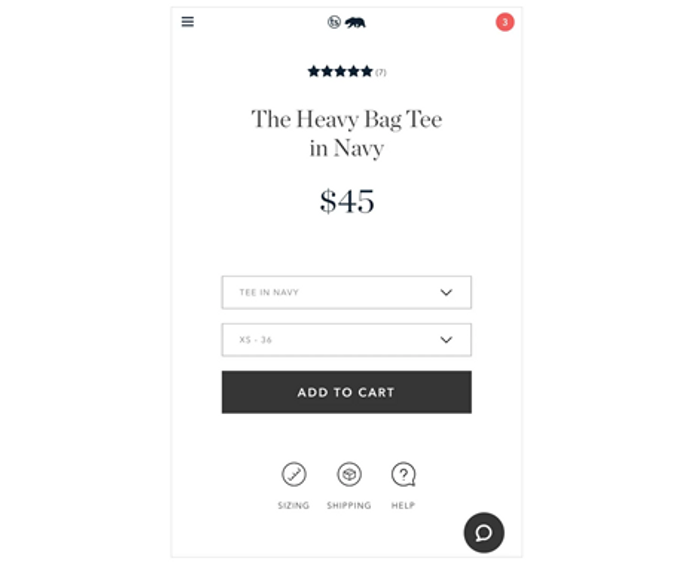
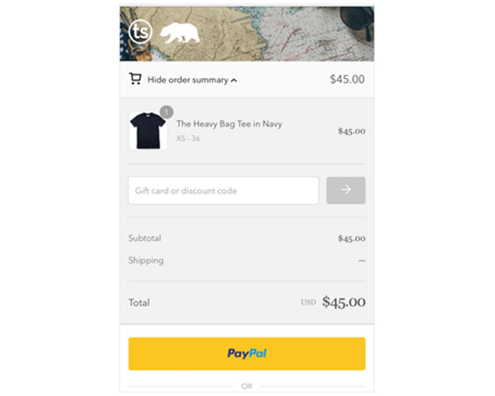
Making your website mobile-responsive is about taking every element into consideration. When you’re designing your website, you want to make sure it displays properly on different screen sizes. The website loading times should be fast and there shouldn’t be any glitches or bugs. You can use the PageSpeed Insights tool to run a quick test on how you’re site is doing.
Of course, it’s impossible to talk about everything in a post related to mobile-responsive design. But if you want to learn the basics, we suggest you read this post.
6. Product Videos
Unless you’ve been living under a rock for the past few years, you’d know that video does way better than just text and images. Videos bring your products to life and give a hands-on overview of how they work. Customers don’t just want to see, they want to see it in action!
Even Mark Zuckerberg himself has said it.
And here are some surprising digital marketing statistics when it comes to producing video content:
- Mobile video consumption has witnessed a 100% incremental growth every year
- 82% of internet traffic will be taken up by mobile online videos by 2022
- 55% of online users view videos every day and 78% of digital users watch videos every week
- 75% of videos are played on mobile devices
There are various creative ways you can embed product videos on your website. Take a look at how Nine Line introduces their Stout Hoodie lineup without even saying a word. It’s a genius!
Another great example is ManCrates, a brand that does a product unboxing promo is just 30 seconds. Customers get to see what they get inside the box whenever they order along with a nifty voice narration over the clip.
Apple’s video is crisp and elegant. Native Union tells the story of how technology provides convenience in everybody’s lives. The home provides a pleasing backdrop to showcase their product and makes everyone feel like they want a product like that in their homes.
The goal of your product video should be to make your audience want to buy your items naturally and not push sales. If they love it, they will go for it. Create that need.
Your product video should also tell your story and make your customers a part of that journey.
You can place your product videos on your landing page or homepage. It’s also a good idea to embed product videos on your blog if you’re talking about its features or giving a general overview.
7. Product Referral Rewards
Referral reward programs are a great way to spread the word about your brand. Humans are social creatures and if you want word to spread like wildfire, give your customers an incentive to help you out.
Referral reward programs also make your customers loyal and more likely to return for additional purchases. Take a look at how ButcherBox’s referral program works. They give free stuff to friends and discounts on items in their packaging whenever someone uses your unique referral code.
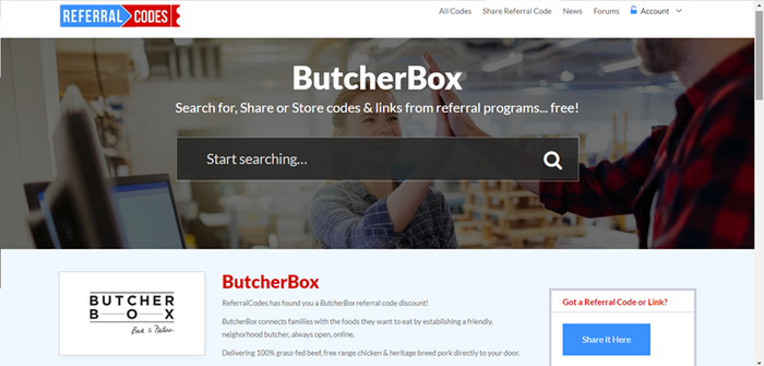
As your friends get free stuff, they refer more people to the brand and the community grows. It’s a win-win!
There are many more brands using this tactic and it’s working in their favor.
Conclusion
The exciting part about using Shopify is that it’s very beginner-friendly and doesn’t require a lot of technical expertise. Setting up a store takes a matter of a minute and there are tons of tutorials online that guide you step-by-step.
If you want to draw inspiration for your design ideas, look at brands like Untuckit, Ratio Coffee, Huel, and Levis Strauss. Start with a simple design, do A/B experiments when optimizing your landing pages, and work your way up from there.
If what you do is working, improve upon it and head in that direction. If it’s not working, cut it and keep tweaking until you find something that works for you.
Guest Post by AdNabu
AdNabu helps improve sales in Google Ads for eCommerce companies. If you are running the search, google shopping, or display campaigns in Google Ads, This software will be able to increase your sales.